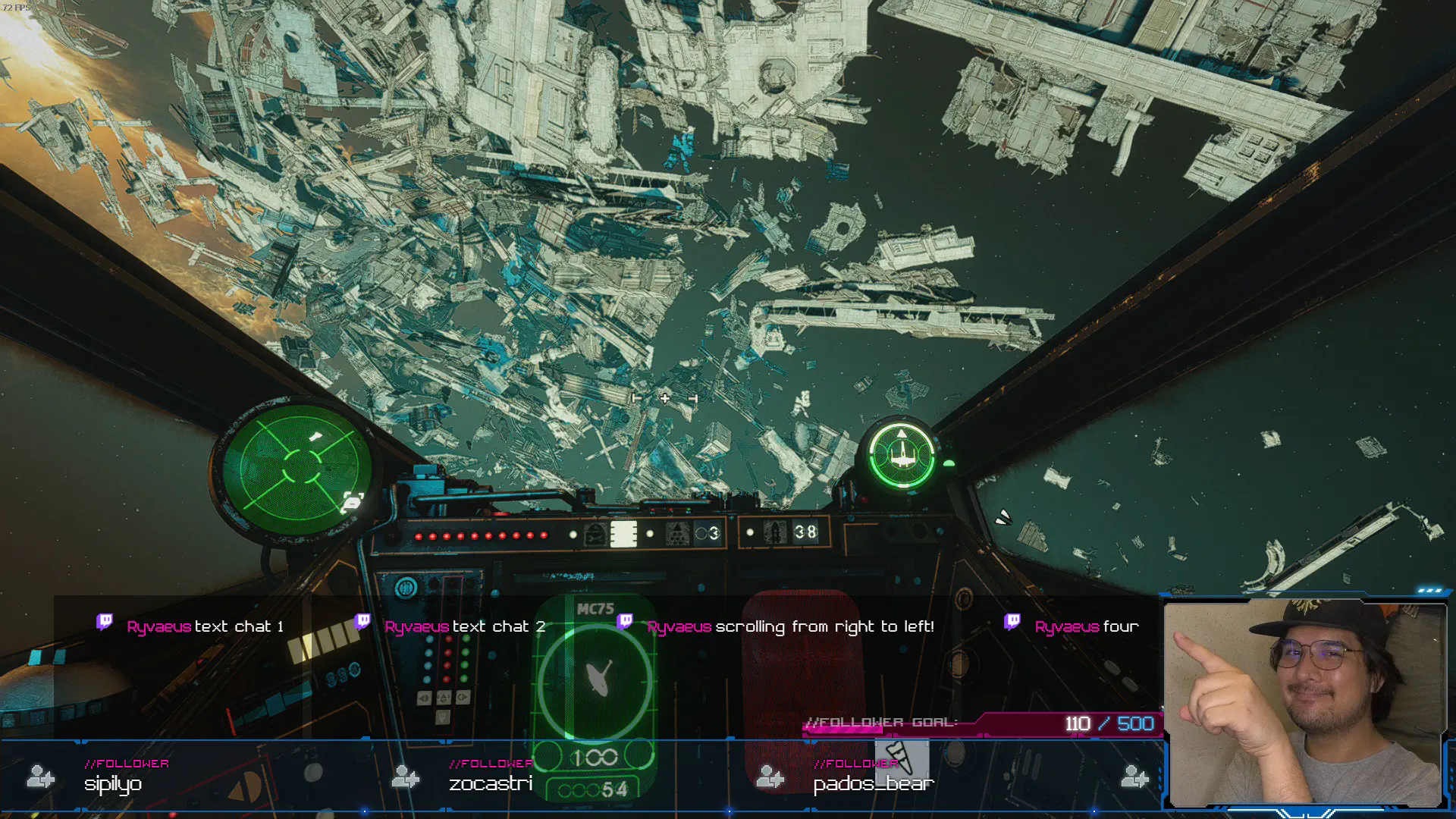
Horizontally Scrolling Chat Overlay
How to use custom CSS to switch from a vertically-flowing chat overlay to a horizontal one
3 minutes

One thing I noticed while playing and streaming Star Wars Squadrons is how much of the viewspace is taken up by the player’s ship instruments and cockpit view. I like having a chat overlay on my streams and, with this UI design cramping the precious little verticle space, I wanted a way to dispaly the chat without encroaching on the viewport.
Video #
Requirements #
The only thing needed to use these lines of custom CSS is the Restream.io Chat browser source embed, and a way to set custom CSS in the browser sources imported into your streaming software. I only have experience with OBS, so I’m not sure if it works in Xsplit or other streaming software.
The custom CSS also assumes that you’re using the default Restream.io Chat appearance options and embed options:
- Compact Mode: Unchecked
- Theme: Default
- Message Alignment: Top'
- Scale: 100%
It’s safe to change any of the other settings including hiding messages after a set amount of time, but if you change any of the ones listed above, the CSS may not work correctly for you.
It’s possible there’s a way to do this on non-Restream.io chat sources, but the class names in these CSS selectors are specific to Restream.io’s implementation.
Custom CSS #
.chat-messages > .message-item:first-child {
  display:none;
} /* Optional. All this does is remove the "Ready to receive messages" chat from Restream */

.chat-messages.reversed {
  flex-direction: row;
  flex-wrap: wrap-reverse;
  justify-content:
  flex-end;
}

.message-info {
  height: auto;
  margin-bottom: 0;
  left: -5px
  !important;
  display: inline;
}

.message-item {
  background-color: rgba(0,0,0,0.5) !important; /* Feel free to adjust this color; it's the background of the chat message box */
  width: auto !important;
  max-width: 49%;
  margin-right: .5em;
  height: 190px; /* Set this to be the same height as set in the browser source properties */
}

.message-sender {
  display: inline;
  vertical-align: inherit !important;
  color: #D30595 !important; /* Feel free to adjust this color; it's the username of the chatter */
  letter-spacing: normal !important;
  font-weight: 600 !important;
  font-size: 1em !important;
}

.message-time {
  display: none;
}

.message-text {
  display: inline;
}
Caveats #
The custom CSS works well if you don’t mind the following issues:
- Long messages might not display the entirety of their content, due to the height and width limits set in the CSS. This is an aesthetic limitation and can be removed, but at that point you might as well just use the regular vertically-scrolling chat overlay.
- There’s no way to set multi-line breaks while also setting a dynamic message item box width, as far as I know. So a medium-length chat message won’t break off onto a new line until it reaches 49% of the browser source width, no matter how much vertical space is actually available.
Hope you found this custom CSS useful! And if you’re able to suggest workarounds to the above to caveats, please do let me know.